Brief: The Georgia Tech Invention Studio was contacted by the licensing office of the Institute and informed that their logo was violating several branding guidelines and would have to be changed. Members of the studio were encouraged to conceptualize new alternatives. What follows details the process I took to rebrand the studio.
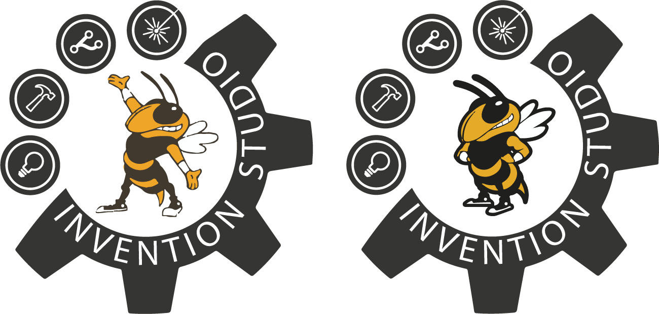
The existing logo: Depicted "Buzz" and the interlocking GT in the same graphic. This arrangment is reserved for the Institute's athletic department only.

The outer gear and icon bearing circles developed quickly. They were meant to communicate the purpose of the studio non-verbally as well as to frame a relation to Georgia Tech within.
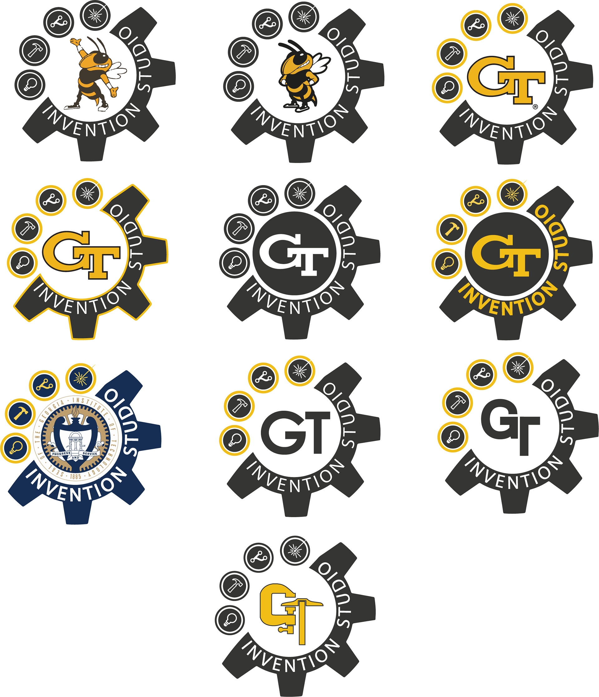
Round 2 Concepts: The licensing department denied the revisions on the grounds that we could not use the Interlocking GT in our design. The second round of concepting explored less traditional options.The intent remained to connect the studio to the institute.


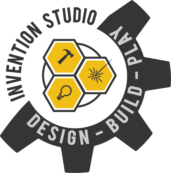
Round 3 Concepts: Using the result of focused ideation, I approached the whole form again. The icons establishing the purpose of the studio were transferred into the honeycomb to drive home the context in which the Studio exists. The name "Invention Studio" was transferred to the gear graphic and white space originally occupied by icons. Alternating text color helped to balance the form.
"Design, Build, Play"- the motto of the studio, was incorporated to further communicate the intention of the studio in a succinct manner.
Round 3 also saw a font change from Myriad Pro to Bebas Neue. A bolder and more condensed font helped give the name of the studio and motto more visual presence.
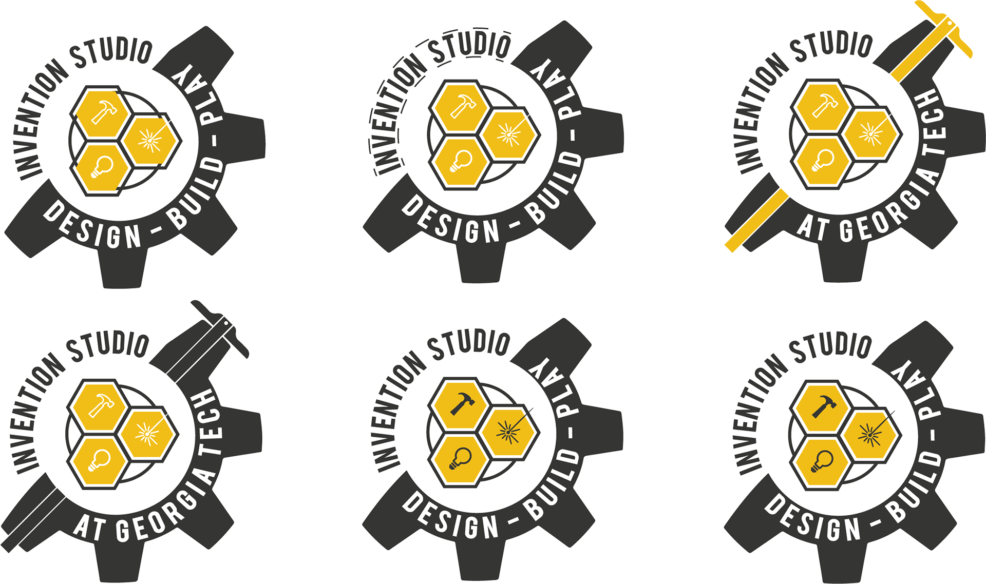
Final Logo: The final logo was approved by the Invention Studio Executive board and by the Georgia Tech Licensing department.